|
For my second theme choice I decided to create a simple vase. It is glazed with a simple white inside and outside on the top, and then the bottom, where it is wider, I used the scrap glaze which turned out as a dark blue. I saw this design actually on a piece that was in the store and wanted to try it. I really like how this piece turned out. 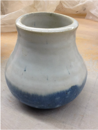 For this plate I was really focusing on my theme. I focused on creating a simple plate, that was basic and obvious as to what it was. Then I worked on the glaze. I used a black against the clear to add contrast to make the design stand out more. This piece was actually based on some plates I have on my inspiration page. Having the design on only one third of the plate makes it stand out more than if it were on one half. I put a lot of effort into this piece and I really like the way it turned out. 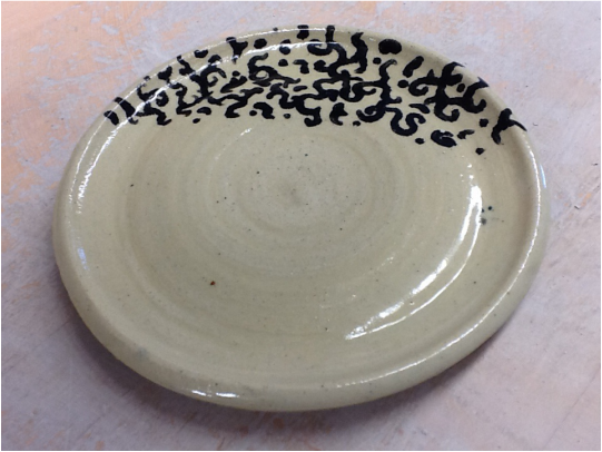 |
AuthorI love art! If you want to see more of the other stuff I do outside of ceramics, check out my page! glorytheangel.deviantart.com Archives
June 2014
Categories |
 RSS Feed
